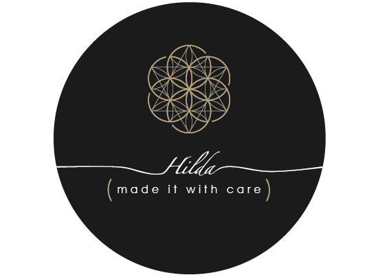
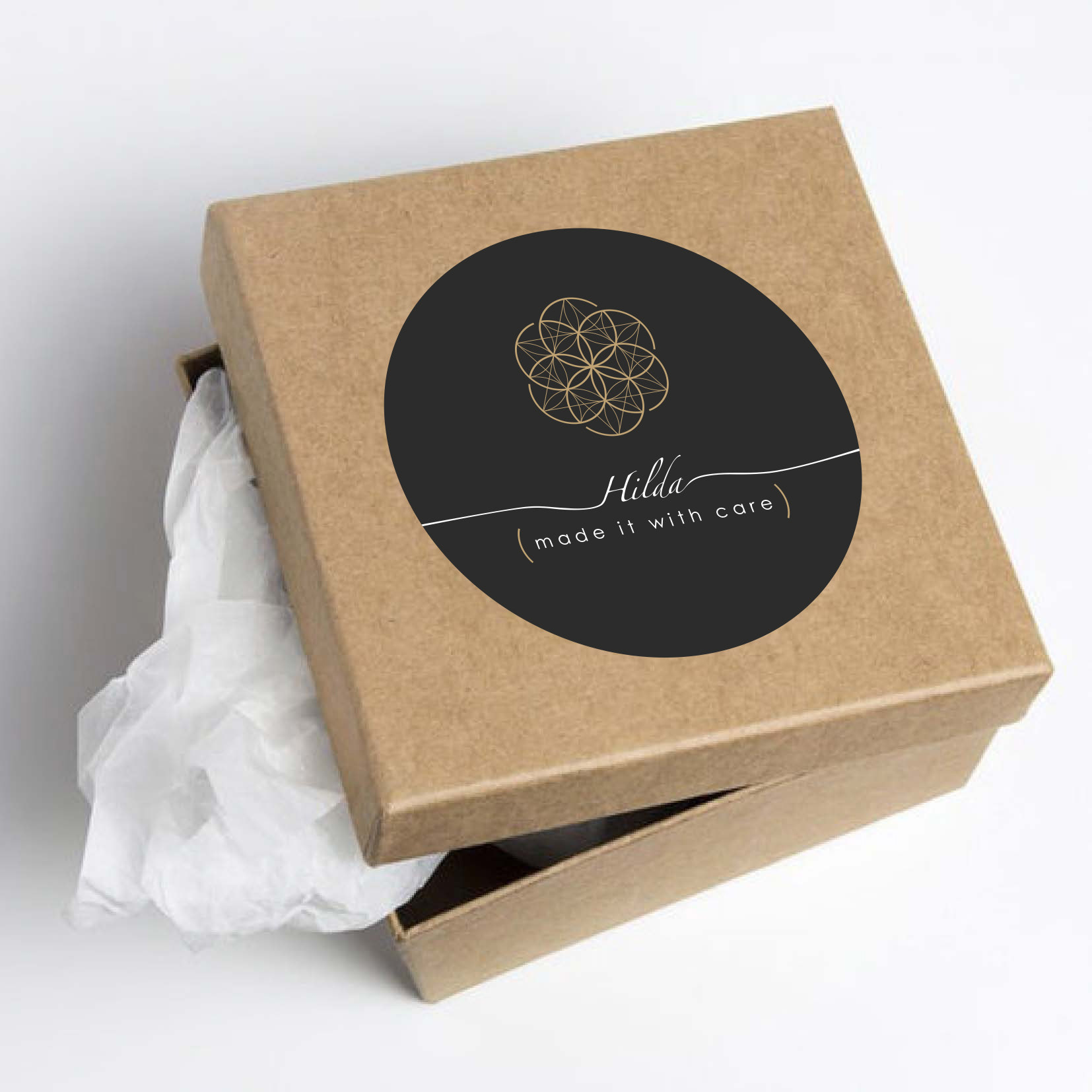
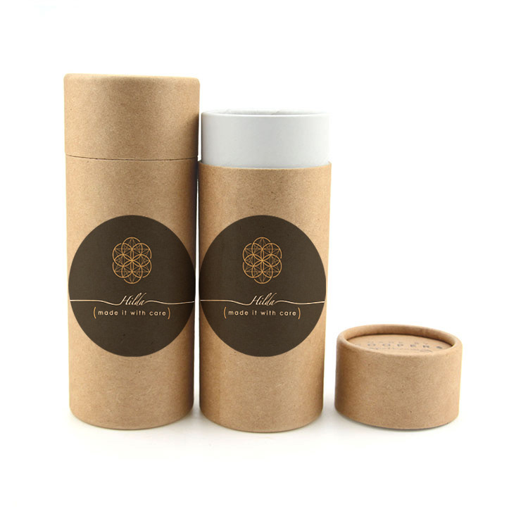
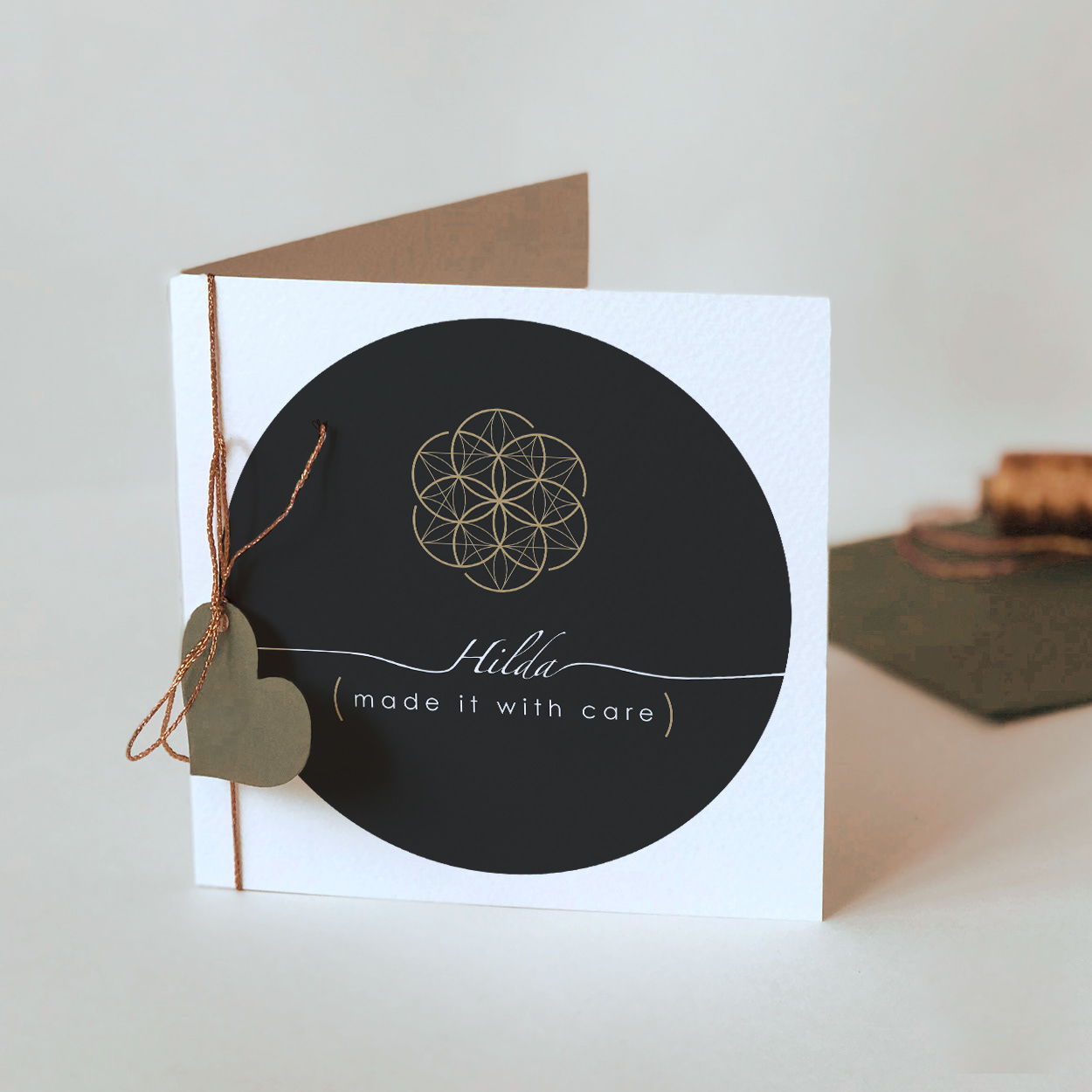
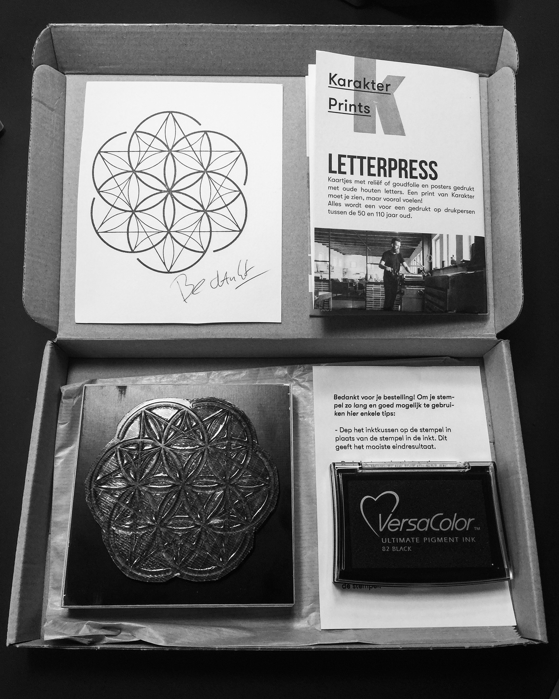
Hilda - Made it with care
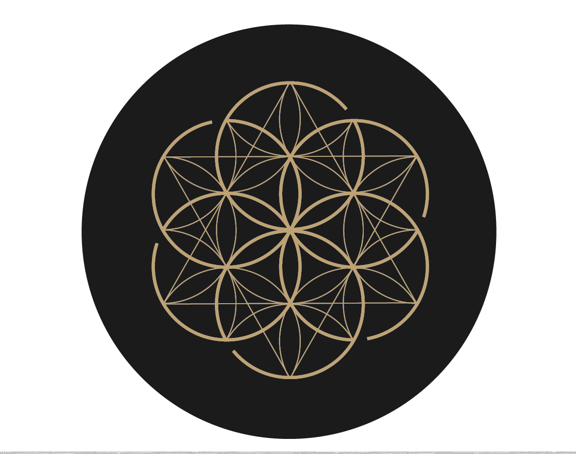
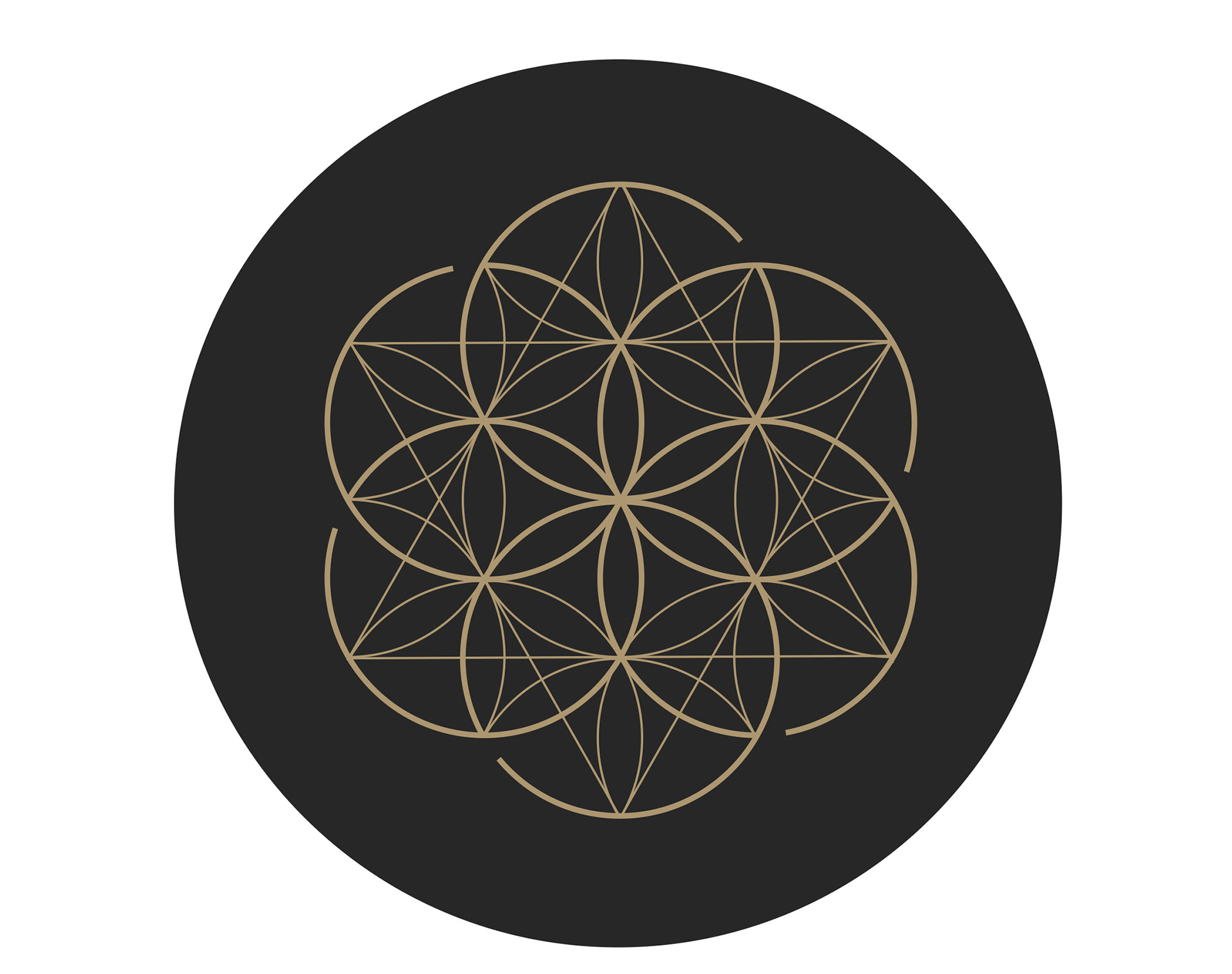
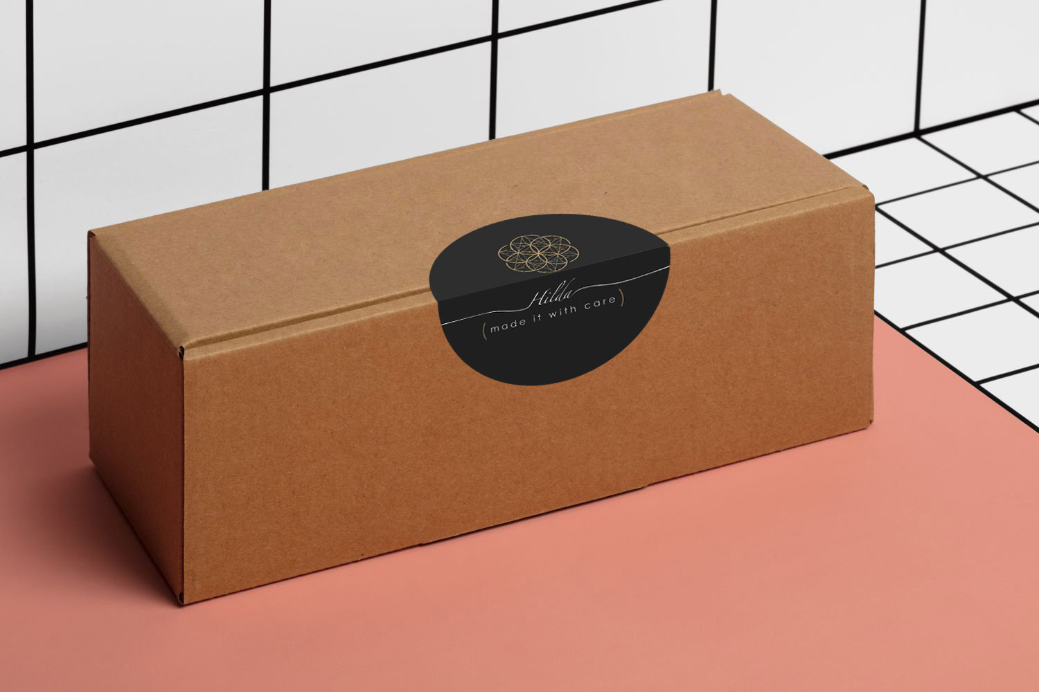
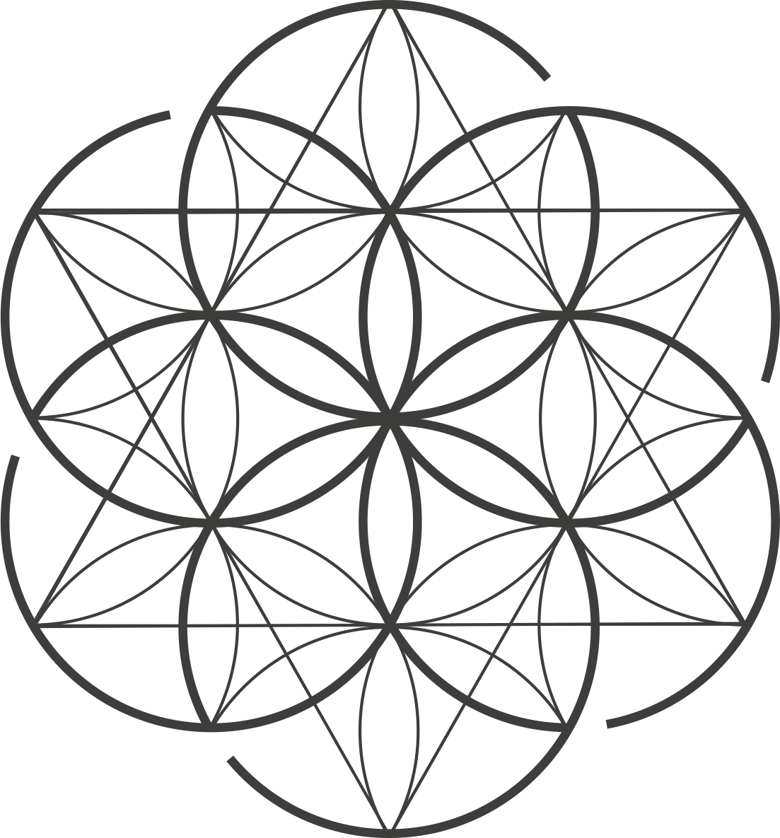
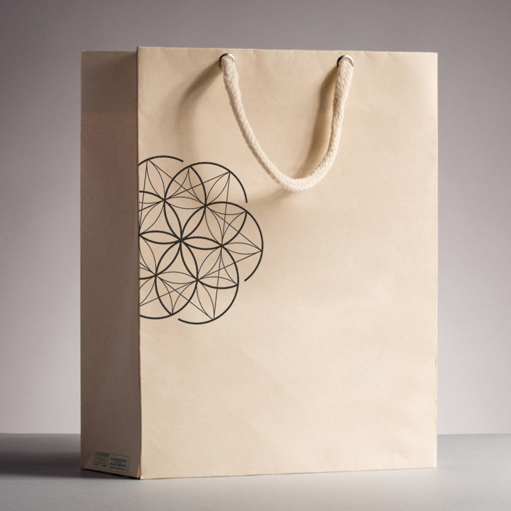
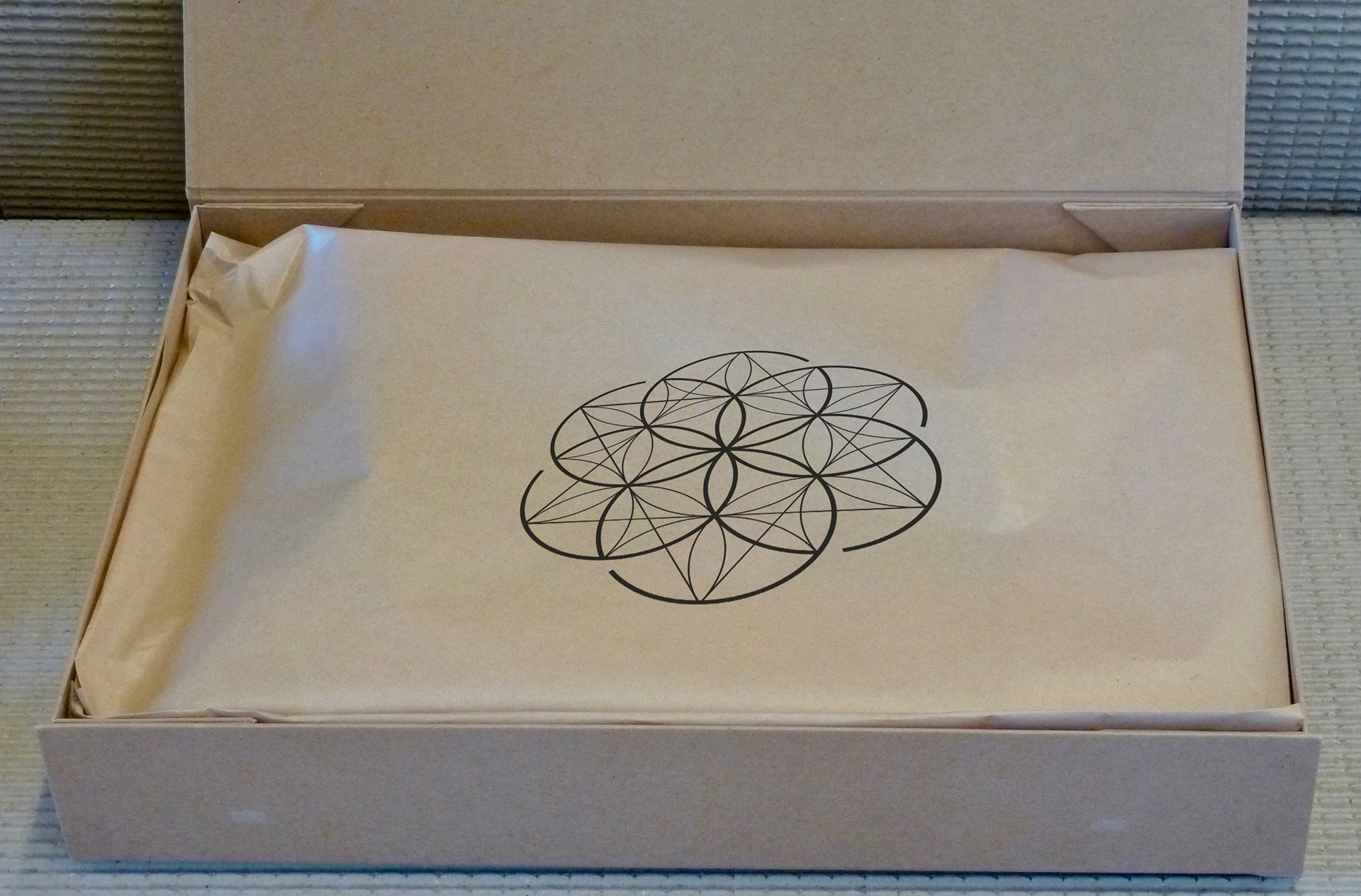
This is my private label and corporate identity. I use this to brand my personal creations (my website, insta label and my recycle-designs). The brand sign is based on 'the seed of life' which is the universal symbol for creation. As I love to work with what is already available, the logo reflects circularity and imperfection. My motto: 'It is not about what it is - it's about what it can become'. In my work and private life I strive to reduce, by re-using and recycling. But always with an eye for the aesthetic. To be able to use the branding on recycled and re-used packaging, I developed a sticker, a stamp and a little card. So I am able to personalise and brand my recycle-designs and re-used packaging in a fun and aesthetic way.
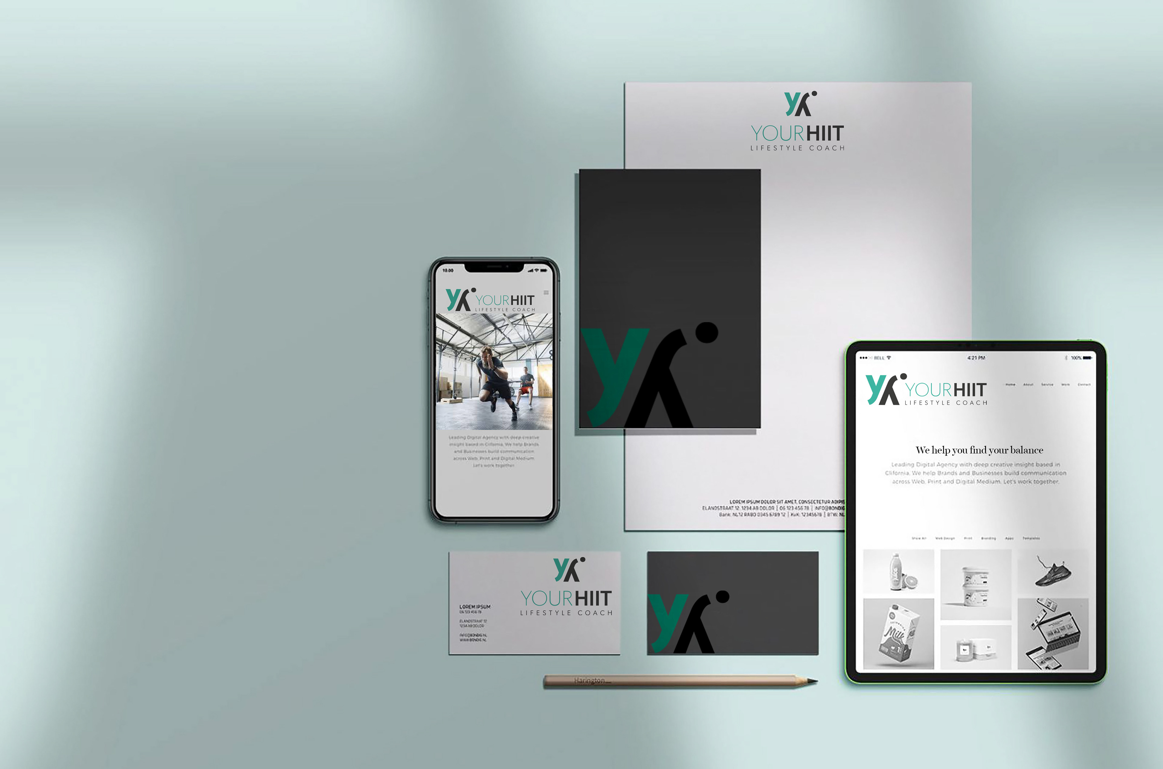
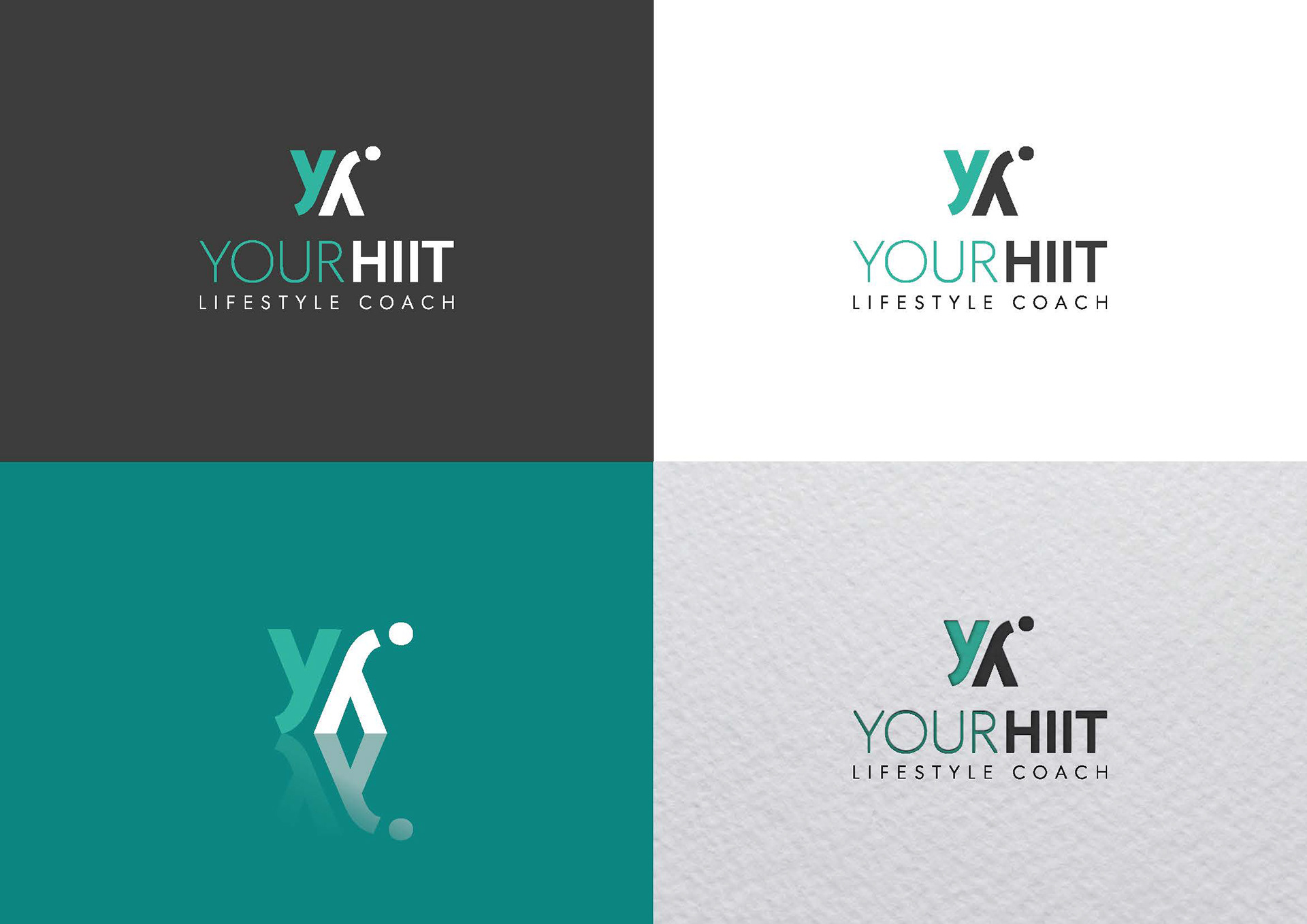
YourHiit
The name was already established, but the owner wanted to professionalise her customer communication with a logo. She desired a modern look and feel, rather bold than too feminine. I developed a 'brand sign' which can be used solo. It is based on the logo initials, reflecting the support and training she offers. The logo is minimalistic, modern. The accent colour associates with sport and health and has a good punch when used in full colour.
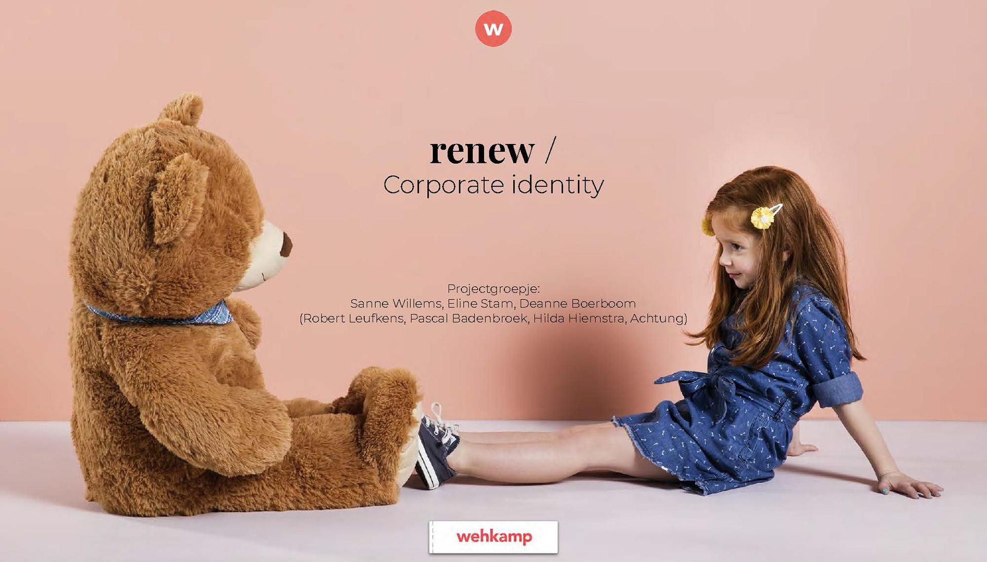
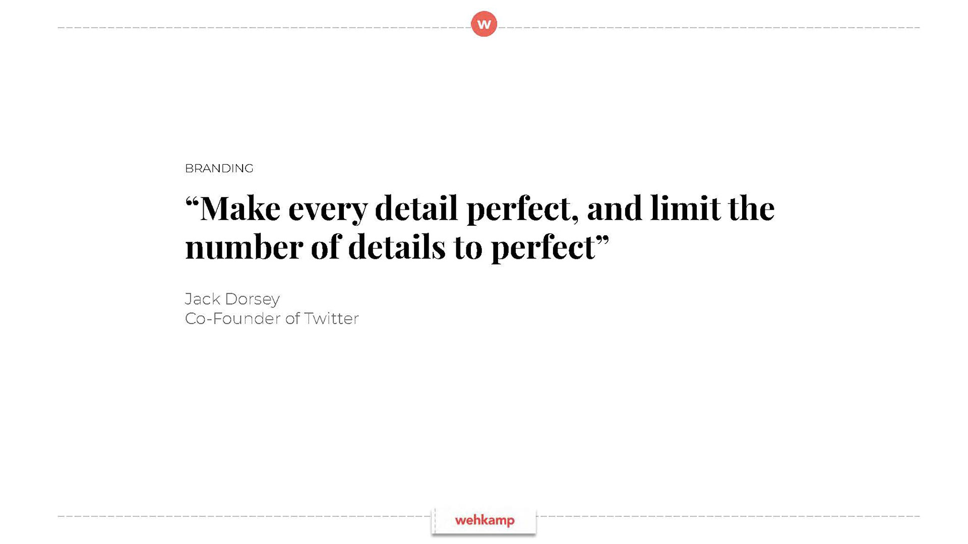
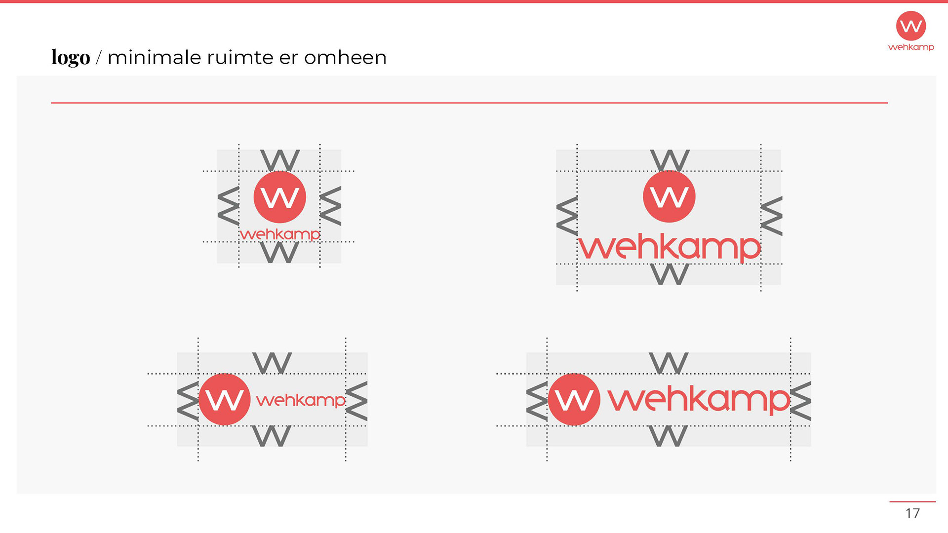
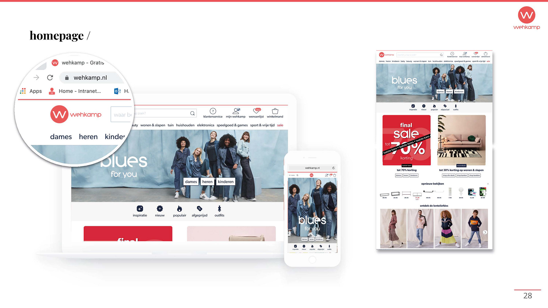
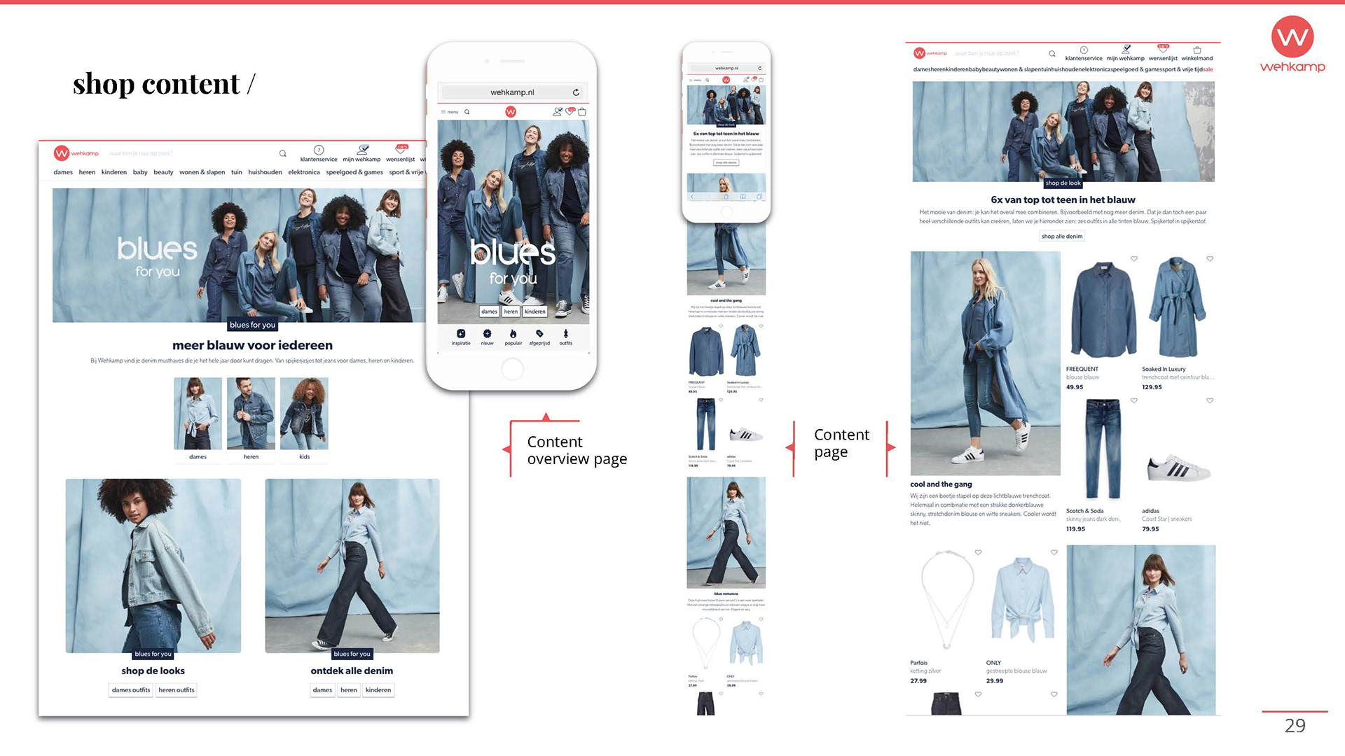
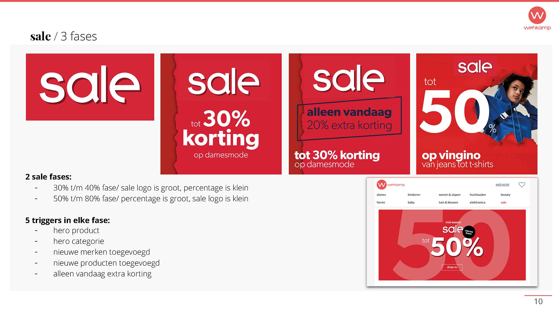
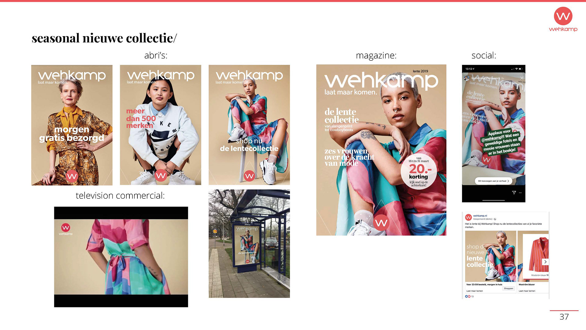
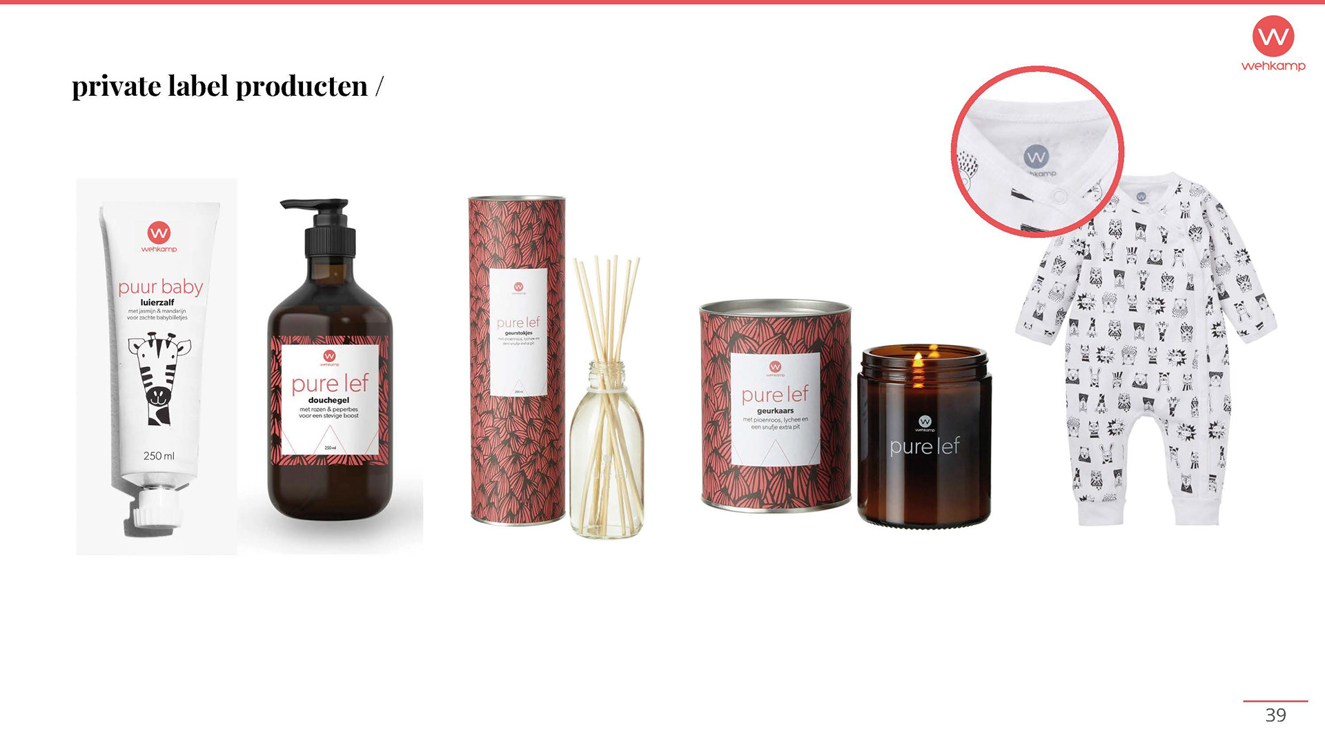
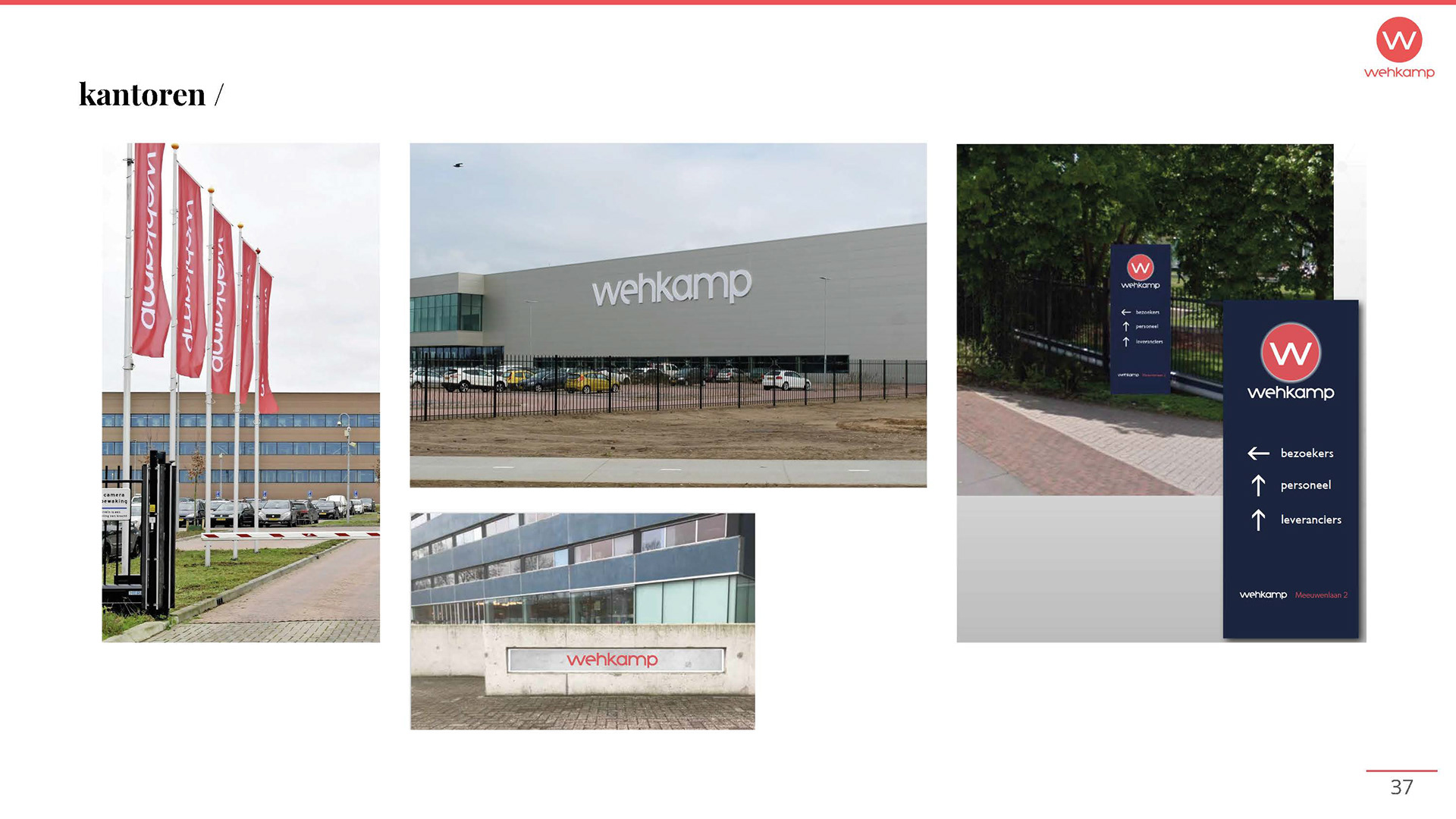
Renew Wehkamp's corporate identity
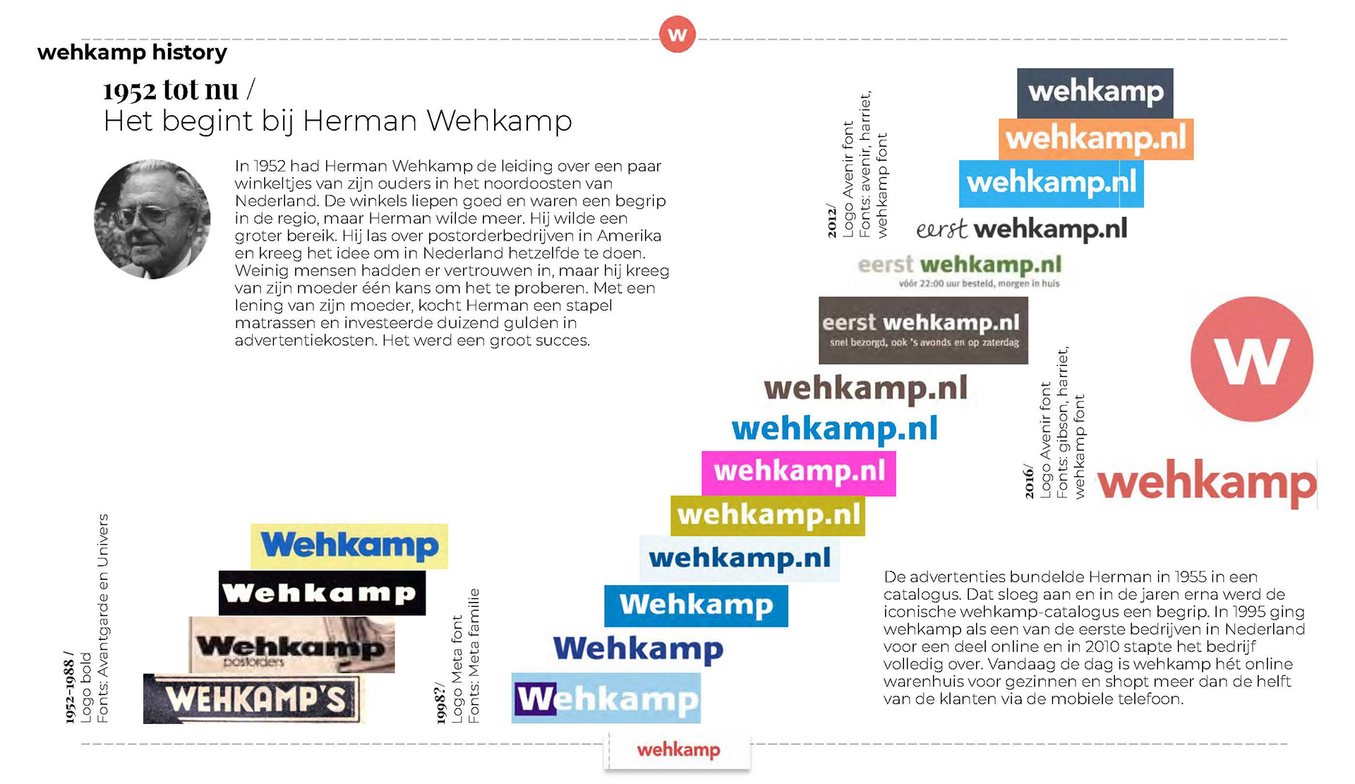
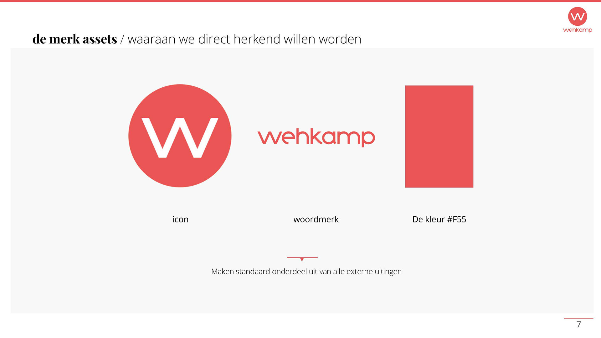
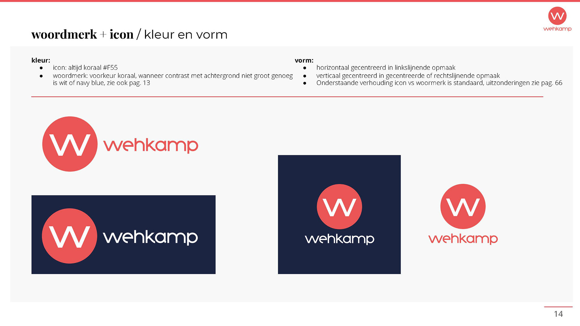
During it's long history, Wehkamp appeared with a great variety of brand logo's, typography, colours etc. From focus groups we learned there were hardly any recognisable brand assets. The logo was outdated, not memorable and not very feminine.
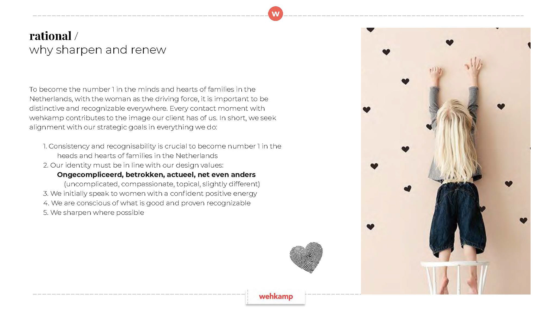
Together with Achtung we developed a renewed corporate identity. From test results with a very high score on the desired points addressed in the creative briefing: memorable, high on brand recognition, feminine and up-to-date.
I was responsible for the creative brief, the entire process, the outcome and the implementation in every touchpoint.